let's connect


Yesterday’s civic spirit,
built for today’s challenges.
How a national movement from the 1930s inspired our look—and still inspires our work today.

At CivicSol,
we believe public work should be bold, optimistic, and clear.
Our visual identity takes its cue from one of America’s most inspiring eras of civic action—the Works Progress Administration (WPA).

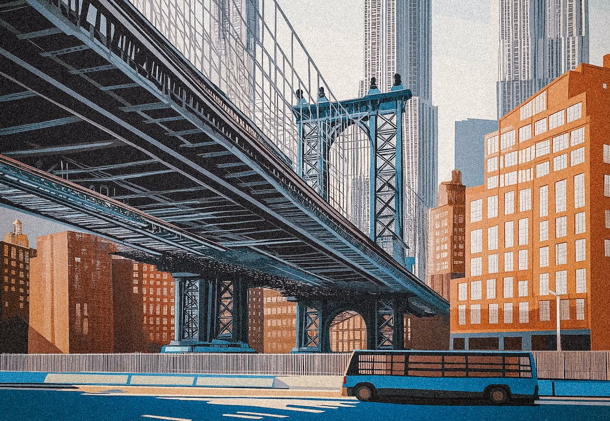

Launched in the 1930s,
the WPA put millions of Americans to work building the nation’s future.
Roads, bridges, parks, schools, and cultural institutions took shape in every corner of the country. Its bold, graphic posters didn’t just advertise projects—they celebrated the people making them happen: teachers, transit workers, engineers, artists, and laborers. They reminded Americans that progress was a shared achievement.

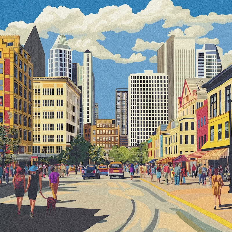
We’ve carried
that same spirit into CivicSol’s identity.
The bold lettering, strong lines, and clear layouts echo the WPA’s confidence and accessibility—inviting people in, not shutting them out. This isn’t nostalgia. It’s a belief that the way we present ideas should be as purposeful and inspiring as the work itself.
2.avif)
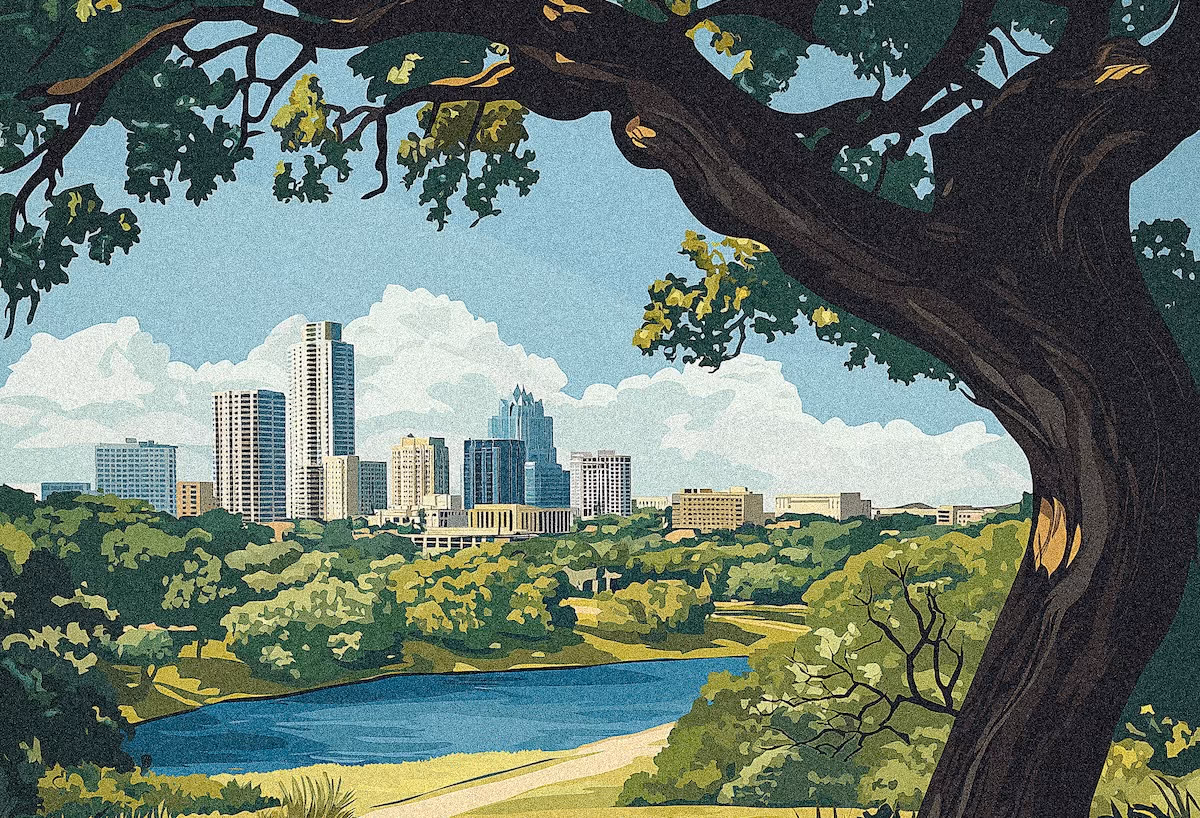
Today,
communities face complex challenges.
Our brand is a signal that public work matters—that smart strategy and clear communication can unite people around a shared vision. Progress happens when we move forward together.

This is more than a visual style,
it’s our commitment to building strategies that work for everyone.
Let's talk